
")
Pantone has become synonymous with the universal language of color, shaping the worlds of design, fashion, and art for decades. The company’s remarkable journey began in the 1950s as a modest commercial printing business. It underwent a transformative shift under the visionary leadership of Lawrence Herbert, who in 1963 introduced the Pantone Matching System (PMS). This innovative system revolutionized industries by standardizing color communication, ensuring consistency across designers, manufacturers, and printers globally.
The Pantone Matching System is central to Pantone’s legacy. By assigning unique codes to specific shades, it eliminates ambiguity in color reproduction. This standardization has become an essential tool for countless industries, particularly graphic design, textiles, and branding. The system’s impact goes beyond practicality, providing a foundation for creativity and collaboration. Designers no longer need to rely on subjective descriptions, as Pantone’s precise language allows ideas to be accurately translated into tangible results.
What Are Pantone Color Systems?
More than 10 million designers and producers around the world rely on Pantone products and services to help define, communicate, and control color from inspiration to realization – across various materials and finishes for graphics, fashion, and product design.
We Have Two Color Systems – the Pantone Matching System (PMS) and the Pantone Fashion, Home + Interiors (FHI) System
Why two?
A. Different needs. Each system is designed to feature market-relevant colors. Fashion designers need more whites, blacks, and neutrals in their palette, while print and packaging designers need colors that will pop on the shelf.
B. Different materials. The appearance of color can change based on the material on which it is produced. In fact, some colors are not achievable at all on a certain material. Having two systems helps to ensure that the colors included are achievable and reproducible based on the materials used.
All color libraries are highly curated and backed by scientific achievability to meet market and manufacturing needs. Our systems are globally available, so when a designer in New York City specifies a certain Pantone Color Number, the manufacturer in Shanghai immediately knows exactly which color they want – and how to achieve it. Even though they may not speak the same language, they both understand the global colors of Pantone.
One of Pantone’s most celebrated traditions is its annual Color of the Year announcement. Introduced in 2000, this event has grown into a cultural phenomenon, capturing the imagination of professionals and enthusiasts alike. The selection process is meticulous, involving a team of experts who study global trends across art, fashion, technology, and social movements. The chosen color symbolizes the spirit of the times, reflecting societal moods and aspirations. For example, vibrant tones may signal optimism and renewal, while subdued shades might embody introspection and resilience.
Pantone’s influence extends beyond industrial applications. Its colors have become a bridge between modern creativity and cultural heritage. Designers often draw on Pantone shades to evoke specific emotions, tell compelling stories, or honor traditions. Certain colors resonate with cultural festivals, historical artifacts, or natural landscapes, seamlessly blending contemporary design with historical and regional contexts. For instance, shades inspired by traditional textiles or iconic architecture help preserve cultural identity while embracing innovation.
The annual Color of the Year remains a vivid example of Pantone’s enduring relevance. It serves not only as a forecast for design trends but also as a reflection of the collective human experience. Whether it’s a bold, energizing hue or a calming, understated tone, the chosen color provides a lens through which we can view the world and our place within it.
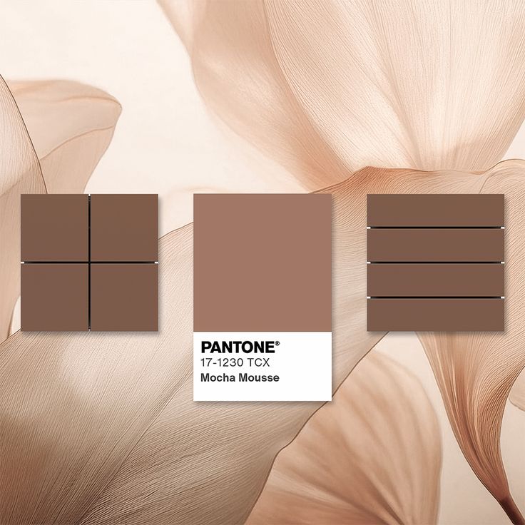
Pantone has announced its Color of the Year for 2025: PANTONE 17-1230 Mocha Mousse, a warm, rich brown hue that embodies comfort and indulgence.
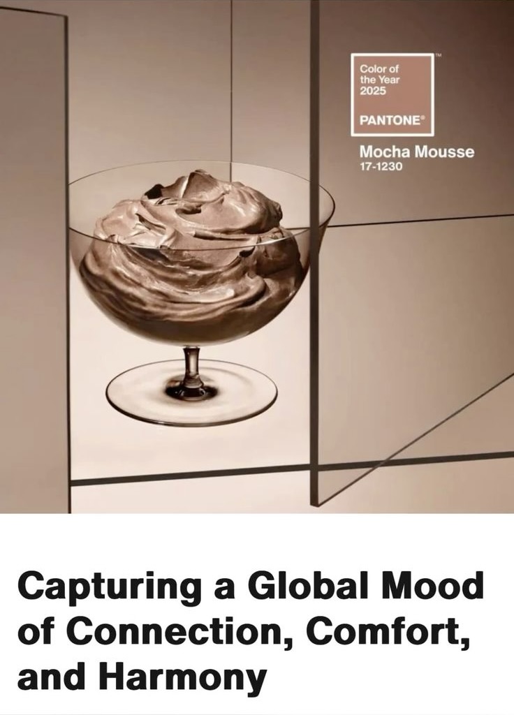
Leatrice Eiseman, Executive Director of the Pantone Color Institute, describes Mocha Mousse as expressing “a level of thoughtful indulgence,” emphasizing both personal enjoyment and the pleasure of sharing with others.
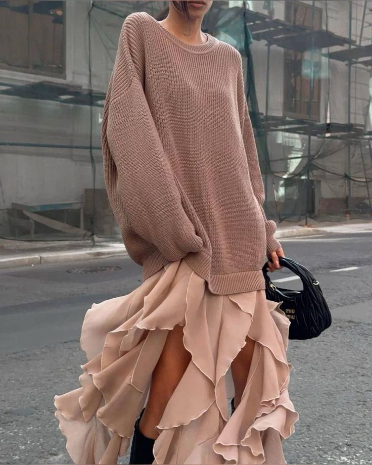
This versatile shade complements various design elements, from natural materials like wood and leather to modern textures such as marble. Its adaptability makes it suitable for a range of applications, including interior design, fashion, and product development.
In line with the growing trend of “quiet luxury,” Mocha Mousse aligns with the shift towards simple shapes and earthy tones in fashion and interiors, making it accessible beyond high-end budgets.


Pantone has also introduced five distinctive color palettes featuring Mocha Mousse, offering designers a spectrum of options from bold combinations to nuanced schemes. These palettes aim to promote design-driven self-care, creating warm and welcoming spaces.
As the Color of the Year, Mocha Mousse is set to influence design trends across various industries throughout 2025, encouraging a focus on comfort, warmth, and shared experiences.


Very interesting!